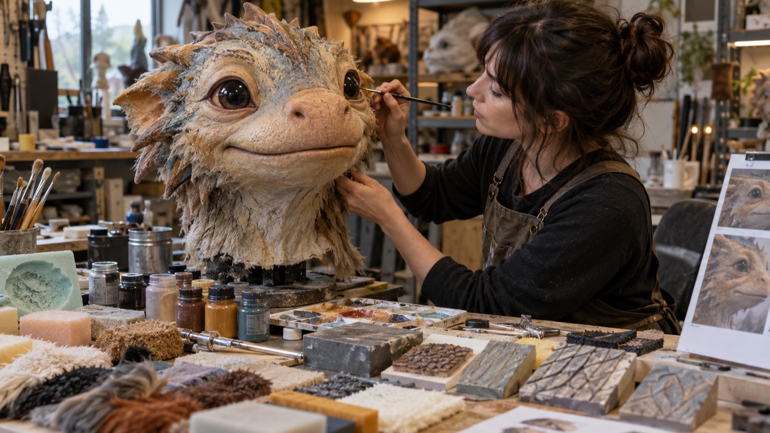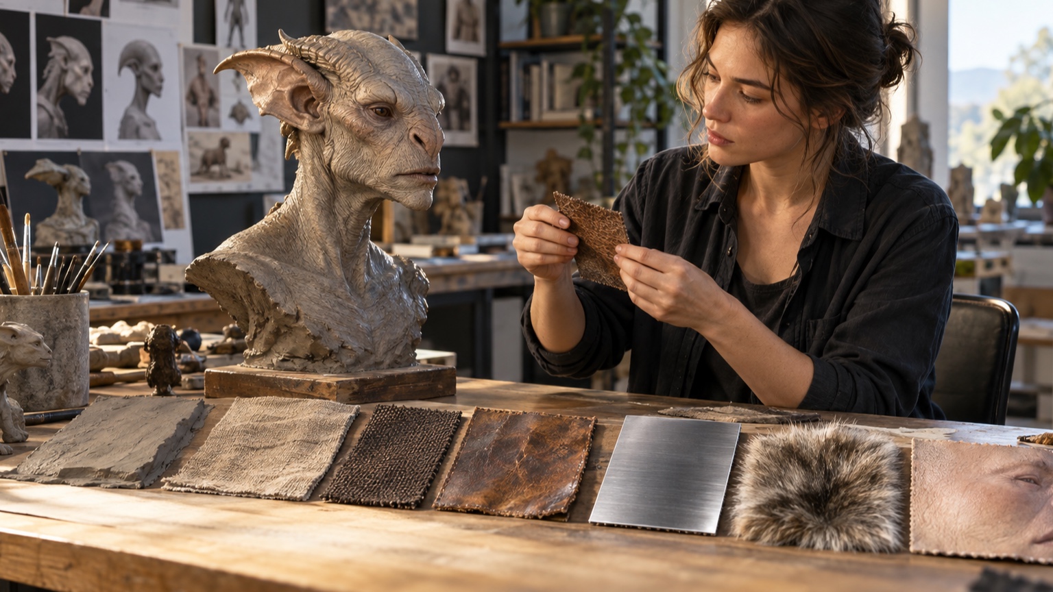
Character Texture Basics: How to Make Characters Look More Realistic
Realistic texture begins with material recognition, not maximum detail. Viewers decide whether a surface is skin, cloth, leather, metal, or paint by combining several clues: how light spreads across it, how sharp its edges are, what scale its pattern uses, how it bends, and where wear appears. Pores alone do not make skin believable, and scratches alone do not make metal. In fact, evenly covering a character with fine marks often makes every surface feel like the same rough plastic. A better approach is to identify the material, study it at multiple distances, attach its texture to the underlying form, and introduce irregularity with control. This beginner-friendly guide moves through roughness, reflection, skin, fabric, leather, metal, painted surfaces, dirt, color, edges, grayscale, focal detail, lighting, and small studies. The aim is not photographic imitation. It is enough accurate evidence that the audience accepts the material and stays focused on the character.
A: No. Repeat the setup against the same baseline.
A: Make a stripped-down study and review it from the real audience position.
A: Only after it succeeds in two matching tests.
A: It should strengthen the main idea, not pull attention away from it.
A: Use the least amount that remains clear at audience distance.
A: Check transitions, side views, extreme ranges, and changing light.
A: Usually. Remove one secondary cue at a time and see whether the result still works.
A: Include the person responsible for the final medium and someone seeing the work fresh.
A: Save the view, settings, materials, limits, and test conditions.
A: Yes. Scale, light, background, and viewing angle can change the result.
Identify the Material Before Rendering
Name the surface as specifically as possible. “Fabric” could mean coarse canvas, brushed wool, glossy satin, or stretched knit, and each one produces different folds, edges, and highlights. Add condition and age: new, faded, damp, dusty, polished, or cracked. Choose two or three traits that will carry the identification. Canvas may rely on a broad weave, matte response, and frayed edge. Trying to show every microscopic fact is unnecessary if the main clues are correct. Write those traits beside the artwork. When later detail does not support one of them, remove it or reserve it for another material.
Observe Texture at Several Distances
Study a material close enough to see its pattern, at arm’s length to see how the pattern groups, and far enough away to notice only value and sheen. Realism depends on all three views. Close detail should not destroy the larger read.
Take your own photographs when possible and keep the lighting consistent. A macro image with a tiny depth of field may exaggerate relief that would be almost invisible under ordinary viewing conditions. Turn the object as you photograph it. Front, side, and raking views separate true surface relief from a shadow that exists only under one light.
Keep Texture Attached to Form
Draw or sculpt the large volume first, then wrap texture around it. Pattern direction should turn with the surface, compress with foreshortening, and disappear around edges. Flat texture pasted across a rounded arm makes the form look printed. Use cross-contour guides before applying repeated marks. On a sphere, spacing narrows toward the sides; on a fold, a weave bends with the cloth. Remove the guides after the pattern begins to carry the same information. On digital models, check texture in a neutral clay shader before color distracts from distortion. Stretched or compressed mapping becomes obvious on simple gray material.
Choose the Correct Detail Scale
Compare marks with familiar features. If a pore approaches the size of an eyelid or a cloth thread rivals a finger, the character may look miniature. Start with broad material variation, then add smaller evidence only where it will be seen.
Preview at final size every few minutes. Digital zoom encourages detail that vanishes in use. For physical work, step back to audience distance and note which features merge into tone.
If the character appears in several formats, make separate detail targets for close promotional images and ordinary presentation. One surface cannot optimize every viewing scale equally.
Create Controlled Irregularity
Natural surfaces vary, but they do not vary evenly. Group spots, scratches, fibers, or pores into areas of activity separated by quieter passages. Change size and direction in response to form and use. Avoid a uniformly random brush. Even randomness becomes a recognizable pattern when applied everywhere. Place irregularity by hand around focal areas and use procedural tools only as a starting layer that can be edited. Look for repeated gaps as well as repeated marks. A texture can feel tiled because its empty spaces recur in a predictable rhythm.
Use Roughness and Reflection
Surface realism often depends more on highlight behavior than on visible bumps. Smooth materials create tighter, clearer reflections; rough materials spread light broadly. Two objects with the same color can feel completely different when their roughness changes.
Keep reflection consistent with wear. Handled edges may become polished, dusty recesses more matte, and oily areas darker and shinier. In painting, control value and edge softness; in 3D, coordinate roughness, normal, and color maps rather than asking one map to do everything. Move a broad light across the finished surface. A convincing roughness pattern changes the highlight without making the underlying form appear dented.
Make Skin More Than Pores
Skin has subtle color shifts, soft transitions over flesh, firmer planes over bone, fine hair, creases at movement, and varying sheen. Begin with those larger qualities. Pores should appear selectively and change scale across the face and body. Look at thin areas around ears, nose, and fingers, as well as thicker or callused areas. Keep eyelids and lips distinct without outlining them heavily. Perfectly even skin can feel synthetic, but excessive blotches and pores can age or roughen a character unintentionally. Compare skin beside the character’s hair, fabric, and hard props. Relative softness and sheen often create realism more effectively than adding another layer of facial detail.
Build Fabric From Weave and Weight
Fabric texture includes construction and behavior. A heavy wool coat makes broad folds and soft edges; thin cotton creates smaller breaks; a stiff technical fabric may hold angular shapes. Establish fold scale before drawing weave.
Show the pattern where it helps describe turning form, then let it fade. Seams, hems, and tension points often communicate textile construction more effectively than covering every panel with threads.
Draw one enlarged fabric swatch away from the character. It can show the weave clearly while the costume itself uses a restrained version appropriate to scale.
Show Leather Through Construction
Leather gains realism from thickness, rounded edges, pores, creases, stitching, and wear at bends. Study whether the item is vegetable-tanned, suede, coated, or synthetic because each surface responds differently. Creases should follow repeated flexing, not scatter across flat areas. Edges may darken, polish, or expose layers. Keep scratches directional and varied so the piece feels handled rather than decorated. Leather around a buckle behaves differently from leather across a broad panel. Study the hardware connection so tension and wear have a credible source.
Distinguish Metal by Condition
Metal is identified by reflection, edge sharpness, and manufacturing more than by gray color. Polished steel, cast iron, brushed aluminum, and tarnished brass need different highlight shapes and surface marks.
Decide whether the metal is bare, coated, oxidized, greasy, or dusty. Damage should affect layers correctly: paint chips may reveal primer and bright metal, while rust grows around exposed areas and joints. Preserve crisp structure beneath the weathering.
Describe Painted and Coated Surfaces
Paint sits on a substrate. Its thickness, gloss, application method, and age determine whether brush marks, orange peel, drips, chips, or fading appear. A factory coating should not look like hand-brushed scenery unless that history is intentional. At damage, show the relationship between coating and base material. Chips gather at impacts and edges, while broad abrasion may thin the color gradually. Keep most of the surface intact so damage has context.
Place Dirt With a Cause
Dirt settles, splashes, transfers, and is wiped away.
Dust collects on upward-facing planes and in recesses; mud rises from the ground; grease gathers near working parts and handling points. Map the source before adding marks.
Use gravity and contact to organize the pattern. Clean streaks can be as informative as dirty ones because they show where rain, cloth, or hands removed buildup. Random brown shading rarely explains a believable environment.
Use Color Variation Sparingly
Small hue and value changes can keep a surface from feeling manufactured. Shift color around wear, warmth, exposure, and material transitions. Group the changes into broad families rather than placing isolated multicolored spots. Check the design at low saturation. If the surface only works because of bright color noise, its material structure may be weak. Preserve clear local color so the character remains easy to identify.
Let Edges Carry Information
Edges reveal thickness, softness, damage, and construction. Cloth can fray, leather rounds, chipped ceramic breaks sharply, and molded plastic may show a seam. Give the silhouette and overlaps the same attention as the interior surface.
Vary edges according to focus. A crisp collar near the face can guide attention, while a soft distant sleeve recedes. Avoid sharpening every boundary equally; uniform edge treatment flattens depth.
Check Texture in Grayscale
Remove color temporarily and look at the value pattern. Texture should support the form rather than pepper it with unrelated dark and light spots. Large value groups need to remain readable beneath small variation. Grayscale also reveals whether materials depend solely on hue. If two adjacent surfaces merge, separate them through roughness, edge, pattern scale, or value—not necessarily all at once.
Control Detail Around the Focal Area
Increase clarity and specificity near the face, hands, or story prop, then reduce density outward.
This does not mean blurring everything else. It means reserving the strongest contrast and most recognizable material evidence for important areas.
Let some surfaces stay broad and calm. Quiet passages give detailed areas room to breathe and help the character read quickly. If the eye moves everywhere, the hierarchy needs simplification.
Test the Surface Under Final Light
Move the light and watch highlights travel across the material. Raking light can exaggerate bumps, frontal light may flatten them, and colored show light can erase subtle hue variation. Approve texture under the conditions in which it will be seen. For reflective surfaces, check the real surroundings as well. A material may reflect bright equipment, audience areas, or dark gaps that were absent in the studio. Adjust roughness or lighting to keep the character readable.
Practice With Small Material Studies
Choose one object—a worn glove, painted tool, fabric scrap, or piece of fruit—and make a short study focused on material rather than perfect drawing. Limit the palette and work at the size used in your character art.
Write which cues created the strongest identification. Repeat the study with one cue removed or exaggerated. A library of small observations will improve character surfaces more reliably than one enormous texture exercise. Arrange finished studies by material family and label the viewing size. Over time, the collection becomes a practical reference for choosing brushes, tools, colors, and edge treatment. Repeat a study in a second medium once the first version works. Translate a painted metal sample into clay and finish, or turn a fabric photograph into a compact digital material. The goal is to preserve the material cues, not reproduce every mark. Comparing the two versions shows which evidence is essential: edge sharpness, reflection shape, pattern scale, thickness, or wear placement. Keep the successful pair with notes about what changed. This habit trains you to design texture intentionally and makes it easier to adapt one character across illustration, sculpture, rendering, print, and physical production without losing the surface identity.