How to Add Texture to Character Designs: A Complete Guide
Texture helps a character communicate material, history, scale, and use. It tells the viewer whether a coat is heavy wool or thin nylon, whether armor is painted metal or molded plastic, and whether a creature’s skin is dry, damp, scarred, or newly formed. Good texture is not an even layer of scratches and pores. It follows the underlying form, changes with contact and wear, and becomes quieter where the eye needs rest. It also has to survive the character’s final medium. A mark that works in a large sculpture may disappear in illustration, while a dense digital brush can become noise when printed or viewed from a distance. This guide begins by defining what the surface must say, then builds references, scale, hierarchy, edge behavior, wear, skin, costume, hard surfaces, color, lighting, movement, samples, and documentation. The aim is a controlled material system that strengthens the character rather than covering good design with detail.
A: Use the least amount that remains clear at audience distance.
A: Check transitions, side views, extreme ranges, and changing light.
A: Usually. Remove one secondary cue at a time and see whether the result still works.
A: Include the person responsible for the final medium and someone seeing the work fresh.
A: Save the view, settings, materials, limits, and test conditions.
A: Yes. Scale, light, background, and viewing angle can change the result.
A: It should succeed repeatedly under final conditions.
A: No. Inspect the craft up close, then judge the result at audience distance.
A: People add detail before proving the basic setup.
A: Yes. Wear, calibration, temperature, and handling can all shift it.
Define What Texture Must Communicate
Write down the material, condition, age, and story function of each major surface. “Old leather repaired many times” gives clearer direction than “add rough texture.” Decide what the audience should understand at first glance and what can reward closer inspection.
Limit the number of competing messages. A jacket cannot look polished, dusty, soaked, cracked, and freshly painted everywhere at once. Choose the conditions that matter to the character and place evidence where those conditions would actually occur.
Add a short “do not use” list to the brief. Excluding irrelevant rust, grime, gloss, or distressing can keep a production team from making every character surface look equally old.
Collect Material-Specific References
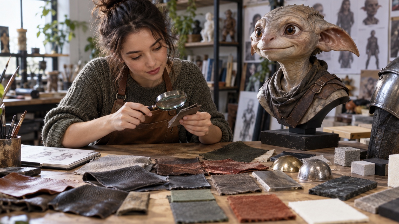
Gather close, medium, and distant views of the real material. Close images reveal fibers and cracks, while wider views show how those details group into larger value and sheen patterns. Include new, worn, wet, dirty, stretched, and damaged examples when relevant. Avoid using another artist’s stylized texture as the only source. It may contain shortcuts designed for a different scale or medium. Direct reference gives you more options and reduces the chance of copying someone else’s surface language. Photograph references beside a ruler and a neutral color card when scale or matching matters. Online images often hide both dimensions and color shifts, which makes later decisions harder to reproduce.
Separate Form From Surface
Finish the large volumes and planes before adding pores, seams, or scratches. Surface marks should wrap around a convincing body, not create the illusion of form by themselves. Test the character under simple light with texture temporarily hidden.
When the base form is weak, texture tends to become camouflage. Correct the skull, clothing volume, armor thickness, or limb transition first. A clean form with restrained detail usually feels more solid than a noisy form with technically accurate marks. Duplicate the clean version before texturing. Toggling between them reveals whether the new surface supports volume or merely makes the character busier.
Match Texture Scale to the Character
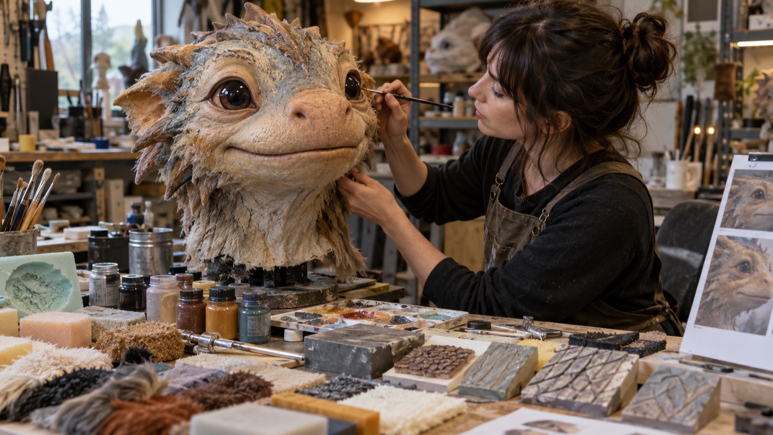
Compare every mark with a known feature such as an eye, finger, button, or seam. Oversized pores can make a human face look miniature; tiny fabric weave can merge into gray noise. The intended viewing distance matters as much as the physical dimensions. Create a small scale chart showing fine, medium, and broad texture. Use fine detail near focal features, medium patterns to identify material, and broad changes for wear or color breakup. Preview the work at delivery size throughout the process. For sculpted work, cast or print the chart in the final process. Molding, cleanup, paint, and distance can reduce detail more than the original clay or digital model suggests.
Build a Material Hierarchy
Rank materials by visual importance and contrast. The face may need soft, controlled variation, while a leather coat receives broader grain and metal hardware carries sharper highlights. If every surface has equal detail and roughness, the character becomes difficult to scan.
Choose one or two signature materials and let supporting surfaces remain quieter. Hierarchy can come from scale, edge sharpness, reflectivity, color variation, or density. It does not require making the focal material the busiest one.
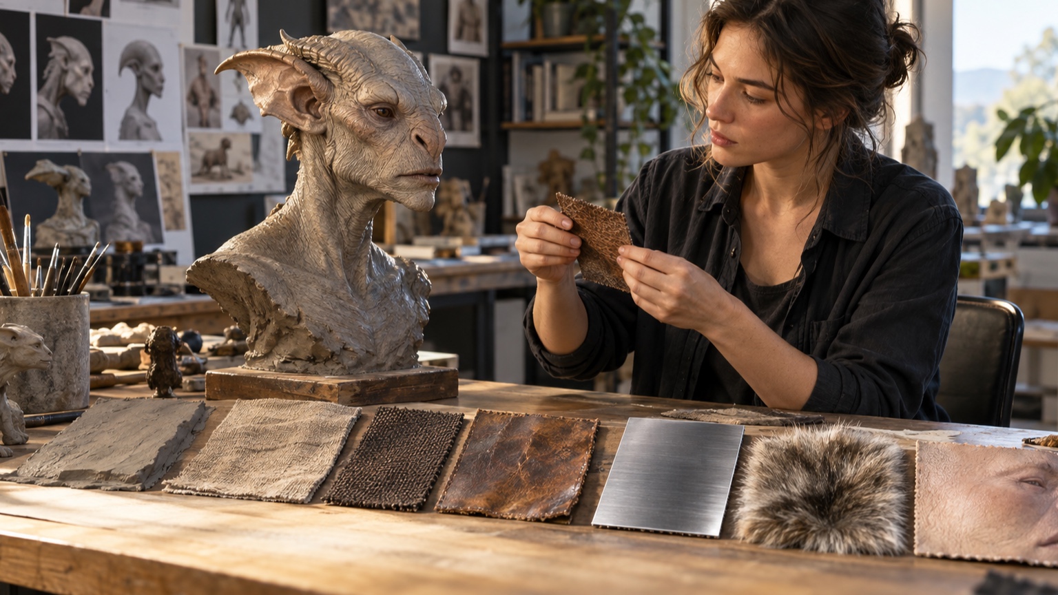
Place the samples next to one another under one light. Materials that look distinct in isolation may merge when their roughness and value are nearly equal.
Use Edge Quality to Describe Material
Material changes are often clearest at edges. Worn leather rounds and softens, chipped paint exposes a hard break, fabric produces a fuzzy contour, and polished metal holds a crisp reflection. Design those behaviors into silhouettes and seams. Avoid outlining every boundary equally. A soft skin-to-skin transition should not receive the same dark edge as a metal plate overlap. Vary hardness according to construction and light rather than using an identical brush around every part. Inspect the outer contour separately. A frayed cuff or chipped plate edge can identify material at a distance when interior marks have already disappeared.
Place Wear Where Contact Happens
Map where hands grip, feet strike, straps rub, joints flex, tools collide, and weather collects. These zones determine abrasion, polish, dirt, and fading. A believable history follows repeated actions.
Keep protected recesses different from exposed ridges. Dust may settle in crevices while high points become cleaner through contact, or grease may darken the exact area a technician touches. Random wear quickly looks decorative because it lacks a cause. Trace a day in the character’s life and mark each contact on a photocopy. That simple map often produces more convincing wear than searching for a dramatic grunge brush.
Vary Repetition to Avoid Noise
Repeated stamps and procedural brushes reveal themselves when spacing, angle, and scale stay constant. Break patterns with clusters, pauses, partial marks, and changes tied to form. Preserve enough repetition that the material still feels coherent. Inspect the work from far away. If variation turns into an even gray field, simplify it into larger groups. Controlled irregularity includes quiet areas; it is not randomness applied at maximum density. Rotate or mirror repeated digital stamps, then repaint their most recognizable edges. A few deliberate interruptions are usually enough to prevent the eye from finding a tiled pattern.
Connect Skin Texture to Anatomy
Skin behaves differently over cheeks, lips, eyelids, joints, palms, and scars. Pores stretch with form, folds gather at compression, and thin areas show subtle color from underlying tissue. Follow anatomical direction instead of laying one pattern over the entire body.
Keep the face’s most mobile zones flexible in both appearance and construction. Deep sculpted pores or heavy paint near mouth corners and eyelids can crack or distort. Let larger planes carry expression before fine texture becomes visible.
Compare neutral and expression poses under the same light. Texture should move with the skin rather than creating a second set of lines unrelated to the performance.
Design Costume Texture by Construction
Start with how the garment is woven, cut, joined, and worn. Grain direction, seam allowance, hems, padding, and fasteners create texture that belongs to the object. Folds should interrupt or compress a pattern rather than allowing it to pass through unchanged. Different panels may show different tension and wear. Elbows polish, cuffs fray, knees crease, and protected linings remain cleaner. These changes can guide attention through the costume without adding arbitrary ornament.
Differentiate Hard Surfaces
Metal, ceramic, painted wood, molded plastic, bone, and composite armor need distinct combinations of edge, reflection, damage, and thickness. Color alone is rarely enough. A chipped metal plate exposes a different substrate than scratched plastic.
Decide how the object was manufactured. Cast parts, machined parts, hammered sheet, and hand-carved pieces leave different evidence. Place seams, fasteners, tool marks, and wear in ways consistent with that process.
Coordinate Texture With Color
Use color variation to support material and wear. Skin shifts around blood-rich areas, fabric fades on exposed planes, and painted surfaces reveal primer or substrate at damage. Keep changes grouped rather than sprinkling many unrelated hues. Check values independently from color. Strong chromatic variation at the same value may disappear at a distance, while tiny dark spots can dominate. The color plan should remain subordinate to the character’s focal hierarchy.
Test Texture Under Lighting
Raking light reveals relief, broad soft light shows color, and specular highlights expose roughness.
Test all three before approving a surface. A texture may look subtle under diffuse studio light and become harsh beneath a small show fixture.
Rotate the light as well as the character. Directional marks should remain attached to the form, and reflective materials should not produce distracting flashes from normal audience positions. Adjust the surface and lighting together.
Reduce Detail at Viewing Distance
Stand where the audience will stand and note which marks survive. Merge tiny features into broader value, roughness, or color groups. Details too small to read can still affect the surface, but they should not consume most of the working time. Photograph the piece at presentation size or shrink the digital image. Protect important seams, scars, material boundaries, and edge damage. Let pores, weave, and scratches become supporting evidence rather than the main event.
Adapt Texture Across Media
Illustration, 3D rendering, sculpture, silicone skin, fabric, and print reproduce detail differently. Translate the material’s identity instead of copying identical marks. A sculpted bump may become a painted value change, while a digital roughness map may need a physical matte coating.
Make conversion tests early. Printing can close dark crevices, molding can soften sharp grain, and flexible paint can fill shallow relief. The final medium decides how much exaggeration is useful.
Plan Texture for Movement
Mark areas that bend, stretch, rub, or contact mechanisms. Reduce fragile relief and heavy coatings there. Align flexible surface patterns with deformation so they compress naturally rather than breaking across the motion. Cycle a finished sample through the intended range. Look for whitening, cracking, delamination, permanent creases, and shine caused by rubbing. Revise the construction before applying the system to the full character.
Create Controlled Texture Samples
Build small swatches that vary one factor at a time: tool, scale, depth, color, roughness, or finish.
Label each sample and photograph it under the intended light. A rejected test can be as informative as the approved one.
Keep the chosen swatch with material recipes and process notes. It gives fabricators and painters a physical target and prevents texture from drifting as separate parts are produced.
Document Materials and Exceptions
Create a map naming each material, its base color, finish, texture scale, wear zones, and approved sample. Note where the general rule changes, such as a flexible joint that needs a smoother surface or a hero prop that receives extra detail. Include cleaning and repair guidance. Abrasive cleaners, incompatible paints, or glossy touch-ups can alter the read even when the form remains intact. Good documentation keeps the character’s material hierarchy consistent over time. Store a labeled repair coupon made with the original materials. It gives future painters a finish and color target after the character has accumulated dust or faded under show lighting. Before handoff, review the character with texture maps, paint layers, and surface effects temporarily disabled one group at a time. This final check exposes details that no longer contribute and surfaces that have become dependent on one fragile layer. Clean the file structure, name physical samples to match the documentation, and photograph the approved character at close, medium, and audience distances. The three views show future teams how the hierarchy is meant to simplify. Texture is finished when the materials remain distinct, the story evidence feels placed rather than scattered, and the character still reads clearly without anyone needing to admire every individual mark.